Choosing a typeface can be done by virtually anyone—simply click a name in a dropdown list. And yet, choosing the right typeface is one of the most deliberated decisions of the design process.
Typography designers dedicate their careers to crafting letterforms. In those small shapes, experts balance things like emotion and neutrality, personality and practicality, legibility and flexibility. Selecting a typeface for a particular design comes with a long list of considerations.
Traditionally, graphic designers have always studied the fundamentals of typography in terms of print design. But as the role of the designer now spans across all types of digital mediums, typography is a bigger beast to tame. In the spirit of brushing up on the fundamentals, use the web typography tips below when selecting a typeface and formatting it for the best reading experience.
The Challenges of Digital Typography
When it comes to print design, there are few variables in how a user will interact with it. A printed page won’t shapeshift depending on who is holding it—colors can be tightly controlled and the typeface will remain static. What a luxury. Digital typography is a lot more fluid. When typography appears on screen, there are many factors that contribute to how it’s displayed, some of which include:
Screen size: It’s impossible to predict, however, Responsive Design aims to accommodate any slight shift in dimensions. But that means typesetting can sometimes be done in vain.
Screen resolution: Pixel density plays a big part in text legibility. Technological advances have made hi-res screens more accessible to the masses, but designers should keep in mind the outliers with older tech.
Screen calibration: Brightness levels determine how colors appear on the screen. The color choices for web design need to accommodate all types of screen settings.
Choosing the Best Font for Reading on Screen
Digital design is an elusive craft—it wasn’t that long ago we were limited to only a few fonts that were compatible with low-res monitors.
We’ve come leaps and bounds in our typeface options. They have been crafted for the screen and are designed with certain nuances that enhance legibility. Just as printed fonts trick the eye to increase legibility, like ink traps, good web fonts will do the same.
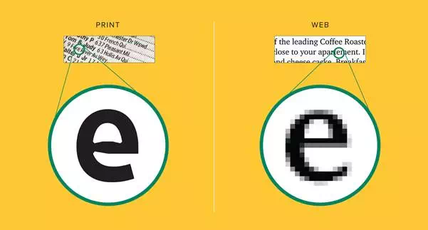
Fonts for print are designed to be made of ink. Web fonts are designed to be made of square pixels.
A design doesn’t have to be limited to the universally standard typefaces (Times New Roman can retire now). There are countless options available for designers to source typefaces that are web-safe and accessible. Google Fonts, Font Library, and Adobe Typekitare a few that offer easy integration and a wide range of choices.
Formatting for a Pleasant Reading Experience
Selecting a typeface is only the beginning. Decisions around line length and height can make or break a digital design. There are simple tips—never use all caps and keep the number of fonts to a minimum—but a lot of formatting decisions rely on trial and error.
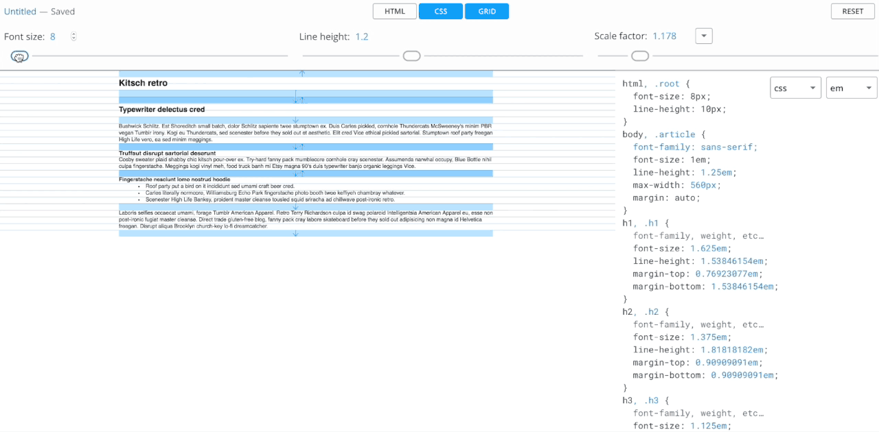
Grid Lover lets users customize type formatting for best readability. CSS is generated to the side, for easy implementation.
The ideal text size relies on the chosen typeface because factors like x-height and counter openness will impact legibility. The text size will then determine the line height and length. An easy way to test the relationship between these decisions is to use tools like Grid Lover, which uses sliders to change the appearance of each measurement.
Choosing the background color behind a block of text is just as important as the font color itself. The contrast between the two will determine how readable the copy is. WebAIM’s Contrast Checkerhelps to easily determine the contrast ratio of color combinations so a palette meets accessibility standards.
Never Ever Skimp on Testing
A guide is useful when designing an onscreen experience, but there are too many factors to know when a design is successful without looking at it in situ. Test typography on screens and display settings that fall on the far edges of average—such as nearly-outdated smartphones, the largest hi-res monitors, and screens turned up blindingly bright. Designs that pass extreme conditions are ready for full user access.
A Guide to Web Typography
There are a lot of things to consider when designing for the screen, and as technology and products advance, the conditions to design will continuously shift. However, when it comes to typography, there are certain things that seem to always hold true.
Here is a comprehensive guide to choosing the right typeface and formatting it for readability.