When we are working on big projects or with groups of developers, we often find that our code is messy, difficult to read, and hard to extend. This is especially true after time passes and we come back and look at it again—we have to try to be in the same mindset where we were when we wrote it.
So what a lot of people have done is they have created CSSarchitectures to help to style their code so that CSS becomes more readable. SMACSS—i.e., Scalable and Modular Architecturefor CSS—aims to do just that. It’s a particular set of CSS architecture guidelines from Jonathan Snook that I’ve adopted.
Now, the architectural approach of SMACSS is a bit different from a CSS framework like Bootstrap or Foundation. Instead, it’s a set of rules, more like a template or guide. So let’s dive into some CSS design patterns to find out how we can use them to make our code better, cleaner, easier to read, and more modular.
Every SMACSS project structure uses five categories:
1. Base
2. Layout
3. Modules
4. State
5. Theme
Base
In SMACSS, base styles define what an element should look like anywhere on the page. They are the defaults. If you’re using a reset stylesheet, this ensures that your resulting styles are the same across browsers despite the differences among their internal, hard-coded base CSS defaults.
In a base style, you should only include bare element selectors, or those with pseudo-classes, but not with class or ID selectors. (You should have really good reason to put class or ID inside it, maybe only if you are styling a third-party plugin’s elements and you need to override the default styling for that particular element.)
Here is an example of how a base file unit should look:
html {
margin:0;
font-family: sans-serif;
} a {
color:#000;
} button {
color:#ababab;
border:1pxsolid#f2f2f2;
}So it should include default sizes, margins, colors, borders, and any other default values you plan to use across your website. Your typography and your form elements should have unified styles which appear on every page and give a feel and look that they are part of the same design and theme.
SMACSS or not, I highly recommend avoiding the use of !important as much as possible, and not to use deep nesting, but I will talk more about that later in this post. Also if your practice is to use reset CSS, this is the place where you should include it. (I prefer to use Sass, so I just include it at the top of the file, rather than having to copy it in or refer to it separately from each page’s <head> element.)
Related: Theming with Sass: An SCSS Tutorial
Layout
Layout styles will divide the page into major sections—not sections like navigation or maybe the accordion, for example, but really top-level divisions:
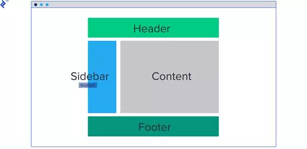
SMACSS layout styles are for major sections like header, sidebar, content/main, and footer.
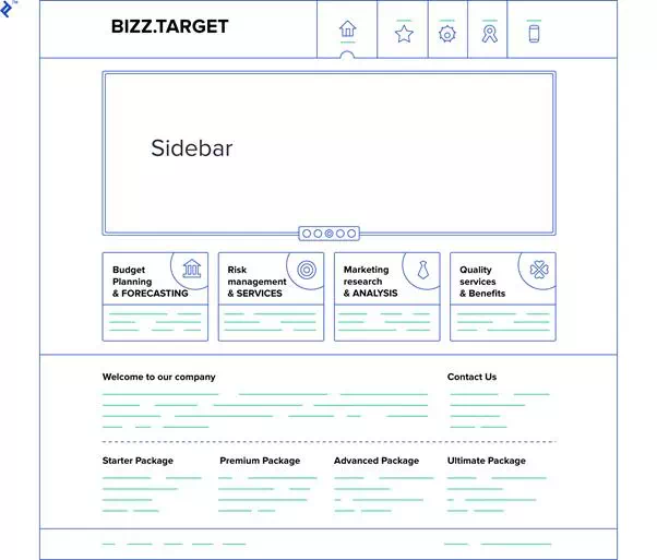
These layouts will hold multiple CSS modules like boxes, cards, unordered lists, galleries, and the like, but I will talk more about modules in the next section. Let’s consider an example web page to see what we can split into layouts:
Here we have header, main, and footer. These layouts have modules like links and logo on the header at the top, boxes and articles on main, and links and copyright for the footer. We usually give layouts an ID selector, as they don’t repeat on the page and they are unique.
Also you should prefix rules for layout styles with the letter l to distinguish them from module styles. Usually here you would style things specific to layout, like border, alignments, margins, etc. Also the background of that part of the page could make sense, even if it doesn’t seem to be quite as layout-specific.
Here is an example of how it should look:
#header {
background:#fcfcfc;
} #header.l-right{
float: right;
} #header.l-align-center{
text-align: center;
}You can also add these helpers for alignments which you can use to easily position elements by just adding the appropriate class to its child or to align its text.
For another example, you could use some default margins on a layout box, like .l-margin having a margin of 20px. Then, wherever you want padding for some container, element, card, or box, you just add the l-margin class to it. But you want something reusable:
.l-full-width {
width:100%;
}Not something internally coupled like this:
.l-width-25 {
width:25px;
}I want to take a moment to talk about naming conventions in SMACSS. If you’ve never heard of the concept of namespacing in CSS, it’s basically adding the name to the beginning of another element to help distinguish it from anything else. But why do we need this?
I don’t know if you’ve ever run into the following problem. You’re writing CSS and you have a label on something—you put in whatever styles you like, and call your class .label. But then you come to another element later on, and you also want it to be .label, but style it differently. So two different things have the same name—a naming conflict.
Namespacing helps you resolve this. Ultimately, they are called the same thing on one level, but they have a different namespace—a different prefix—and thus can represent two different styles:
.box--label {
color: blue;
} .card--label {
color: red;
}Module
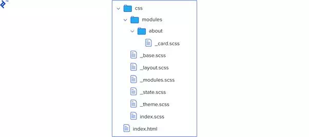
Like I mentioned earlier, SMACSS modules are smaller bits of code that are reusable on the page, and they are part of a single layout. These are parts of CSS that we want to store in a separate folder, as we will have a lot of these on a single page. And as a project grows, we can split using folder structure best practices, i.e., by modules/pages:
So in the previous example, we had an article, which can be a module on its own. How should CSS be structured here? We should have a class .article which can have child elements title and text. So to be able to keep it in the same module, we need to prefix the child elements:
.article {
background:#f32;
} .article--title {
font-size:16px;
} .article--text {
font-size:12px;
}You may notice that we are using two hyphens after the module prefix. The reason is that sometimes module names have two words or their own prefixes like big-article. We need to have two hyphens in order to tell what part of it is the child element—e.g. compare big-article-title to big-article--title and big-article--text.
Also, you can nest modules inside modules if a particular module takes a large portion of the page:
<div class="box">
<div class="box--label">This is box label</div>
<li class="list--li">Box list element</li>
</div>
Here, in this simple example, you can see that box is a module and list is another module inside it. So list--li is a child of the list module and not of the box. One of the key concepts here is to use two selectors max per each CSS rule, but in most scenarios to have only one selector with prefixes.
This way, we can avoid duplicating rules and also having extra selectors on child elements with the same names, thus improving speed. But it also helps us avoid using the unwanted !important-style rules, which are a sign of poorly structured CSS projects.
Good (note the single selector):
.red--box {
background:#fafcfe;
} .red-box--list {
color:#000;
}Bad (note the repetition within selectors and the overlapping reference method):
.red.box{
background:#fafcfe;
} .red.box.list{
color:#000;
} .boxul{
color:#fafafa;
} State
What state defines in SMACSS is a way to describe how our modules look in different dynamic situations. So this part is really for interactivity: We want different behavior if an element is considered to be hidden, expanded, or modified. For example, a jQuery accordion will need help defining when you can or can’t see an element’s content. It helps us to define an element’s style at a specific time.
States are applied to the same element as layout so we are adding an additional rule which will override previous ones, if any. The state rule is given precedence, as it’s the last one in the chain of rules.
As with layout styles, we tend to use prefixes here. This helps us to recognize them and to give them priority. Here we use the isprefix, as in is-hidden or is-selected.
<header id="header">
<li class="nav--item is-selected">Contact</li>
<li class="nav--item">About</li>
</header>
.nav--item.is-selected {
color:#fff;
}Here, !important may be used, as state is often used as a JavaScript modification and not at render time. For example, you have element that’s hidden on page load. On button click, you want to show it. But the default class is like this:
.box.element{
display: none;
}So if you just add this:
.is-shown {
display: block;
}It will remain hidden even after you add the .is-shown class to the element via JavaScript. This is because the first rule is two levels deep and will override it.
So you can instead define the state class like this:
.is-shown {
display: block!important;
}This is how we distinguish state modifiers from layout ones, which apply only on a page’s initial load. This will work now while maintaining the advantages of minimal selectors.
Theme
This one should be the most obvious, as it’s used to contain the rules of the primary colors, shapes, borders, shadows, and such. Mostly these are elements which repeat across a whole website. We don’t want to redefine them each time we create them. Instead we want to define a unique class which we only add on later to a default element.
.button-large {
width:60px;
height:60px;
}<button class="button-large">Like</button>
Don’t confuse these SMACSS theme rules with base ones, since base rules target only default appearance and they tend to be something like resetting to default browser settings, whereas a theme unit is more of a type of styling where it gives the final look, unique for this specific color scheme.
Theme rules can also be useful if a site has more than a single style or perhaps a couple of themes used in different states and therefore can be easily changed or swapped during some events on a page, e.g. with a theme-switch button. At the very least, they keep all theme styles in one place so you can change them easily and keep them nicely organized.