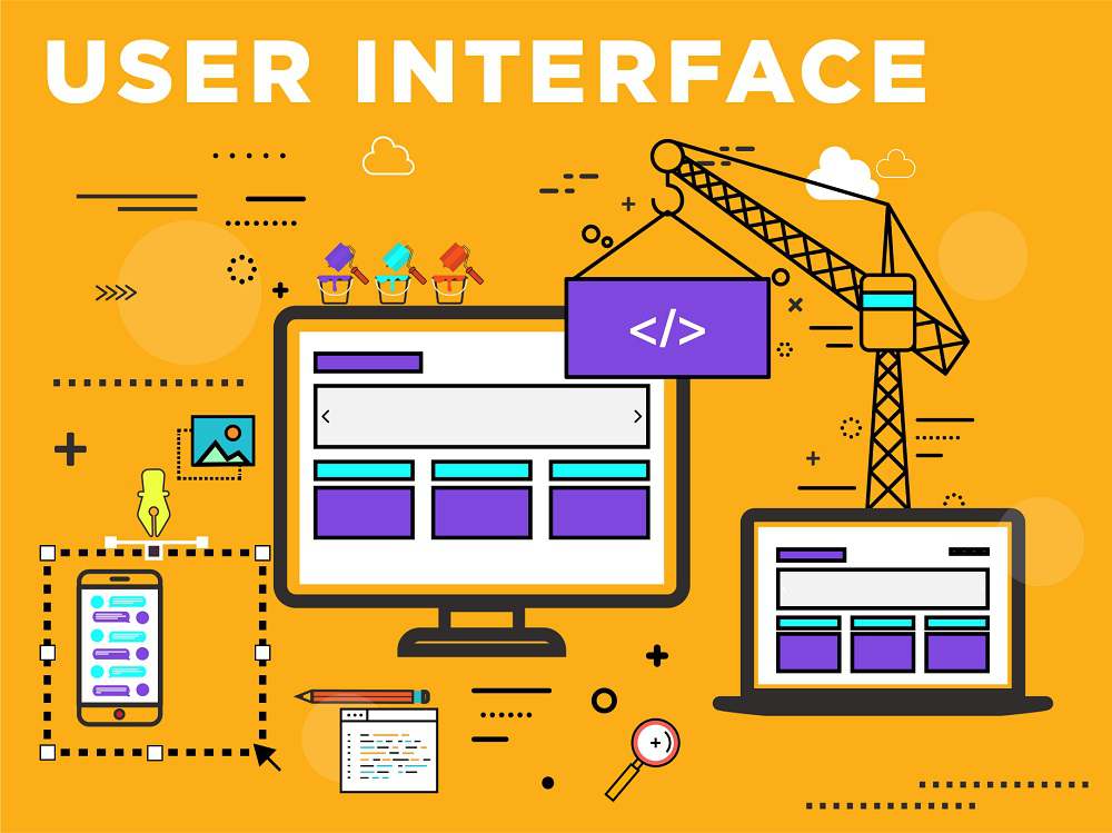
User interface is the first impression of a software system from the user’s point of view. Therefore any software system must satisfy the requirement of user.
Functions and Features of UI
User Interface (UI) mainly performs two functions −
- Accepting the user’s input
- Displaying the output
User interface plays a crucial role in any software system. It is possibly the only visible aspect of a software system as −
· Users will initially see the architecture of software system’s external user interface without considering its internal architecture.
· A good user interface must attract the user to use the software system without mistakes. It should help the user to understand the software system easily without misleading information. A bad UI may cause market failure against the competition of software system.
· UI has its syntax and semantics. The syntax comprises component types such as textual, icon, button etc. and usability summarizes the semantics of UI. The quality of UI is characterized by its look and feel (syntax) and its usability (semantics).
· There are basically two major kinds of user interface − a) Textual b) Graphical.
· Software in different domains may require different style of its user interface for e.g. calculator need only a small area for displaying numeric numbers, but a big area for commands, A web page needs forms, links, tabs, etc.
Graphical User Interface
A graphical user interface is the most common type of user interface available today. It is a very user friendly because it makes use of pictures, graphics, and icons – hence why it is called ‘graphical’.
It is also known as a WIMP interface because it makes use of −
· Windows − A rectangular area on the screen where the commonly used applications run.
· Icons − A picture or symbol which is used to represent a software application or hardware device.
· Menus − A list of options from which the user can choose what they require.
· Pointers − A symbol such as an arrow which moves around the screen as user moves the mouse. It helps user to select objects.
Design of User Interface
It starts with task analysis which understands the user’s primary tasks and problem domain. It should be designed in terms of User’s terminology and outset of user’s job rather than programmer’s.
Proper or good UI design works from the user’s capabilities and limitations not the machines. While designing the UI, knowledge of the nature of the user’s work and environment is also critical.
Elements of UI
To perform user interface analysis, the practitioner needs to study and understand four elements −
· The users who will interact with the system through the interface
· The tasks that end users must perform to do their work
· The content that is presented as part of the interface
· The work environment in which these tasks will be conducted
Levels of UI Design
The task to be performed and then can be divided, which are assigned to the user or machine, based on knowledge of the capabilities and limitations of each.
The design of a user interface is often divided into four different levels −
· The conceptual level − It describes the basic entities considering the user’s view of the system and the actions possible upon them.
· The semantic level − It describes the functions performed by the system i.e. description of the functional requirements of the system, but does not address how the user will invoke the functions.
· The syntactic level − It describes the sequences of inputs and outputs required to invoke the functions described.
· The lexical level − It determines how the inputs and outputs are actually formed from primitive hardware operations.
Steps of UI Design
User interface design is an iterative process, where all the iteration explains and refines the information developed in the preceding steps. General steps for user interface design −
· Defines user interface objects and actions (operations).
· Defines events (user actions) that will cause the state of the user interface to change.
· Indicates how the user interprets the state of the system from information provided through the interface.
· Describe each interface state as it will actually look to the end user.
User Interface Development Process
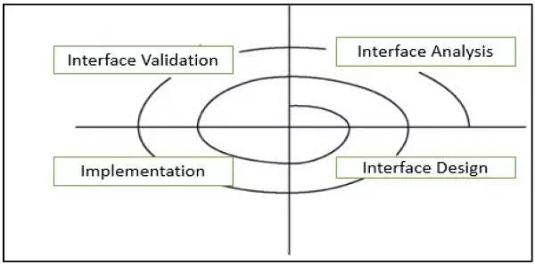
It follows a spiral process as shown in the following diagram −

Interface analysis
It concentrates or focuses on users, tasks, content, and work environment who will interact with the system. Defines the human – and computer-oriented tasks that are required to achieve system function.
Interface design
It defines a set of interface objects, actions, and their screen representations that enable a user to perform all defined tasks in a manner that meets every usability objective defined for the system.
Interface construction
It starts with a prototype that enables usage scenarios to be evaluated and continues with development tools to complete the construction.
Interface validation
It focuses on the ability of the interface to implement every user task correctly, accommodate all task variations, to achieve all general user requirements, and the degree to which the interface is easy to use and easy to learn.
User Interface Models
When a user interface is analyzed and designed following four models are used −
User profile model
· Created by a user or software engineer, which establishes the profile of the end-users of the system based on age, gender, physical abilities, education, motivation, goals, and personality.
· Considers syntactic and semantic knowledge of the user and classifies users as novices, knowledgeable intermittent, and knowledgeable frequent users.
Design model
· Created by a software engineer which incorporates data, architectural, interface, and procedural representations of the software.
· Derived from the analysis model of the requirements and controlled by the information in the requirements specification which helps in defining the user of the system.
Implementation model
· Created by the software implementers who work on look and feel of the interface combined with all supporting information (books, videos, help files) that describes system syntax and semantics.
· Serves as a translation of the design model and attempts to agree with the user’s mental model so that users then feel comfortable with the software and use it effectively.
User’s mental model
· Created by the user when interacting with the application. It contains the image of the system that users carry in their heads.
· Often called the user’s system perception and correctness of the description depends upon the user’s profile and overall familiarity with the software in the application domain.
Design Considerations of User Interface
User centered
A user interface must be a user-centered product which involves users throughout a product’s development lifecycle. The prototype of a user interface should be available to users and feedback from users, should be incorporated into the final product.
Simple and Intuitive
UI provides simplicity and intuitiveness so that it can be used quickly and effectively without instructions. GUI are better than textual UI, as GUI consists of menus, windows, and buttons and is operated by simply using mouse.
Place Users in Control
Do not force users to complete predefined sequences. Give them options—to cancel or to save and return to where they left off. Use terms throughout the interface that users can understand, rather than system or developer terms.
Provide users with some indication that an action has been performed, either by showing them the results of the action, or acknowledging that the action has taken place successfully.
Transparency
UI must be transparent that helps users to feel like they are reaching right through computer and directly manipulating the objects they are working with. The interface can be made transparent by giving users work objects rather than system objects. For example, users should understand that their system password must be at least 6 characters, not how many bytes of storage a password must be.
Use progressive disclosure
Always provide easy access to common features and frequently used actions. Hide less common features and actions and allow users to navigate them. Do not try to put every piece of information in one main window. Use secondary window for information that is not key information.
Consistency
UI maintains the consistency within and across product, keep interaction results the same, UI commands and menus should have the same format, command punctuations should be similar and parameters should be passed to all commands in the same way. UI should not have behavior’s that can surprise the users and should include the mechanisms that allows users to recover from their mistakes.
Integration
The software system should integrate smoothly with other applications such as MS notepad and MS-Office. It can use Clipboard commands directly to perform data interchange.
Component Oriented
UI design must be modular and incorporate component oriented architecture so that the design of UI will have the same requirements as the design of the main body of the software system. The modules can easily be modified and replaced without affecting of other parts of the system.
Customizable
The architecture of whole software system incorporates plug-in modules, which allow many different people independently extend the software. It allows individual users to select from various available forms in order to suit personal preferences and needs.
Reduce Users’ Memory Load
Do not force users to have to remember and repeat what the computer should be doing for them. For example, when filling in online forms, customer names, addresses, and telephone numbers should be remembered by the system once a user has entered them, or once a customer record has been opened.
User interfaces support long-term memory retrieval by providing users with items for them to recognize rather than having to recall information.
Separation
UI must be separated from the logic of the system through its implementation for increasing reusability and maintainability.


Comments are closed