User interfaces can be classified into the following three categories:
• Command language-based interfaces
• Menu-based interfaces
• Direct manipulation interfaces
Command Language-based Interface
A command language-based interface – as the name itself suggests, is based on designing a command language which the user can use to issue the commands. The user is expected to frame the appropriate commands in the language and type them in appropriately whenever required. A simple command language-based interface might simply assign unique names to the different commands. However, a more sophisticated command language-based interface may allow users to compose complex commands by using a set of primitive commands. Such a facility to compose commands dramatically reduces the number of command names one would have to remember. Thus, a command language-based interface can be made concise requiring minimal typing by the user. Command language-based interfaces allow fast interaction with the computer and simplify the input of complex commands.
Menu-based Interface
An important advantage of a menu-based interface over a command language-based interface is that a menu-based interface does not require the users to remember the exact syntax of the commands. A menu-based interface is based on recognition of the command names, rather than recollection. Further, in a menu-based interface the typing effort is minimal as most interactions are carried out through menu selections using a pointing device. This factor is an important consideration for the occasional user who cannot type fast.
However, experienced users find a menu-based user interface to be slower than a command language-based interface because an experienced user can type fast and can get speed advantage by composing different primitive commands to express complex commands. Composing commands in a menu-based interface is not possible. This is because of the fact that actions involving logical connectives (and, or, etc.) are awkward to specify in a menu-based system. Also, if the number of choices is large, it is difficult to select from the menu. In fact, a major challenge in the design of a menu-based interface is to structure large number of menu choices into manageable forms.
Direct Manipulation Interfaces
Direct manipulation interfaces present the interface to the user in the form of visual models (i.e. icons or objects). For this reason, direct manipulation interfaces are sometimes called as iconic interface. In this type of interface, the user issues commands by performing actions on the visual representations of the objects, e.g. pull an icon representing a file into an icon representing a trash box, for deleting the file. Important advantages of iconic interfaces include the fact that the icons can be recognized by the users very easily, and that icons are language-independent. However, direct manipulation interfaces can be considered slow for experienced users. Also, it is difficult to give complex commands using a direct manipulation interface. For example, if one has to drag an icon representing the file to a trash box icon for deleting a file, then in order to delete all the files in the directory one has to perform this operation individually for all files – which could be very easily done by issuing a command like delete *.*.
Menu-based interfaces
When the menu choices are large, they can be structured as the following way:
Scrolling menu
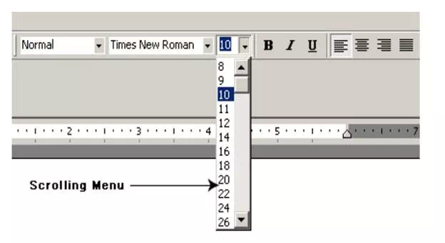
When a full choice list cannot be displayed within the menu area, scrolling of the menu items is required. This would enable the user to view and select the menu items that cannot be accommodated on the screen. However, in a scrolling menu all the commands should be highly correlated, so that the user can easily locate a command that he needs. This is important since the user cannot see all the commands at any one time. An example situation where a scrolling menu is frequently used is font size selection in a document processor (as shown in fig. 9.3). Here, the user knows that the command list contains only the font sizes that are arranged in some order and he can scroll up and down to find the size he is looking for. However, if the commands do not have any definite ordering relation, then the user would have to in the worst case, scroll through all the commands to find the exact command he is looking for, making this organization inefficient.
Font size selection using scrolling menu

Walking menu
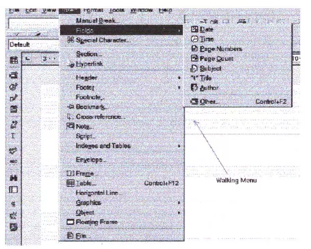
Walking menu is very commonly used to structure a large collection of menu items. In this technique, when a menu item is selected, it causes further menu items to be displayed adjacent to it in a sub-menu. An example of a walking menu is shown in fig. 9.4. A walking menu can successfully be used to structure commands only if there are tens rather than hundreds of choices since each adjacently displayed menu does take up screen space and the total screen area is after limited.
Example of walking menu

Hierarchical menu
In this technique, the menu items are organized in a hierarchy or tree structure. Selecting a menu item causes the current menu display to be replaced by an appropriate sub-menu. Thus in this case, one can consider the menu and its various sub-menus to form a hierarchical tree-like structure. Walking menu can be considered to be a form of hierarchical menu which is practicable when the tree is shallow. Hierarchical menu can be used to manage large number of choices, but the users are likely to face navigational problems because they might lose track of where they are in the menu tree. This probably is the main reason why this type of interface is very rarely used.
Characteristics of command language-based interface
Characteristics of command language-based interface have been discussed earlier.
Disadvantages of command language-based interface
Command language-based interfaces suffer from several drawbacks. Usually, command language-based interfaces are difficult to learn and require the user to memorize the set of primitive commands. Also, most users make errors while formulating commands in the command language and also while typing them in. Further, in a command language-based interface, all interactions with the system is through a key-board and cannot take advantage of effective interaction devices such as a mouse. Obviously, for casual and inexperienced users, command language-based interfaces are not suitable.
Issues in designing a command language-based interface
Two overbearing command design issues are to reduce the number of primitive commands that a user has to remember and to minimize the total typing required while issuing commands. These can be elaborated as follows:
• The designer has to decide what mnemonics are to be used for the different commands. The designer should try to develop meaningful mnemonics and yet be concise to minimize the amount of typing required. For example, the shortest mnemonic should be assigned to the most frequently used commands.
• The designer has to decide whether the users will be allowed to redefine the command names to suit their own preferences. Letting a user define his own mnemonics for various commands is a useful feature, but it increases the complexity of user interface development.
• The designer has to decide whether it should be possible to compose primitive commands to form more complex commands. A sophisticated command composition facility would require the syntax and semantics of the various command composition options to be clearly and unambiguously specified. The ability to combine commands is a powerful facility in the hands of experienced users, but quite unnecessary for inexperienced users.
Types of menus and their features
Three main types of menus are scrolling menu, walking menu, and hierarchical menu. The features of scrolling menu, walking menu, and hierarchical menu have been discussed earlier.
Iconic interface
Direct manipulation interfaces present the interface to the user in the form of visual models (i.e. icons or objects). For this reason, direct manipulation interfaces are sometimes called iconic interfaces. In this type of interface, the user issues commands by performing actions on the visual representations of the objects, e.g. pull an icon representing a file into an icon representing a trash box, for deleting the file.
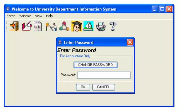
Example of an iconic interface

iconic interface. Here, the user is presented with a set of icons at the top of the frame for performing various activities. On clicking on any of the icons, either the user is prompted with a sub menu or the desired activity is performed.
Component-based GUI development
A development style based on widgets (window objects) is called component based (or widget-based) GUI development style. There are several important advantages of using a widget-based design style. One of the most important reasons to use widgets as building blocks is because they help users learn an interface fast. In this style of development, the user interfaces for different applications are built from the same basic components. Therefore, the user can extend his knowledge of the behavior of the standard components from one application to the other. Also, the component-based user interface development style reduces the application programmer’s work significantly as he is more of a user interface component integrator than a programmer in the traditional sense.
Need for component-based GUI development
The current style of user interface development is component-based. It recognizes that every user interface can easily be built from a handful of predefined components such as menus, dialog boxes, forms, etc. Besides the standard components, and the facilities to create good interfaces from them, one of the basic support available to the user interface developers is the window system. The window system lets the application programmer create and manipulate windows without having to write the basic windowing functions.


Comments are closed