The X-window functions are low-level functions written in C language which can be called from application programs. But only the very serious application designer would program directly using the X-windows library routines. Built on top of X-windows are higher-level functions collectively called Xtoolkit. Xtoolkit consists of a set of basic widgets and a set of routines to manipulate these widgets. One of the most widely used widget sets is X/Motif. Digital Equipment Corporation (DEC) used the basic X-window functions to develop its own look and feel for interface designs called DECWindows.
Popularity of X-Window
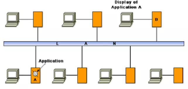
One of the important reasons behind the extreme popularity of the X-window system is probably due to the fact that it allows development of portable GUIs. Applications developed using X-window system are device-independent. Also, applications developed using the X-window system become network independent in the sense that the interface would work just as well on a terminal connected anywhere on the same network as the computer running the application is. Network-independent GUI operation has been schematically represented. Here, “A” is the computer application in which the application is running. “B” can be any computer on the network from where interaction with the application can be made. Network-independent GUI was pioneered by the Xwindow system in the mid-eighties at MIT (Massachusetts Institute of Technology) with support from DEC (Digital Equipment Corporation). Now-day’s many user interface development systems support network-independent GUI development, e.g. the AWT and Swing components of Java.
Network-independent GUI

Architecture of an X-System
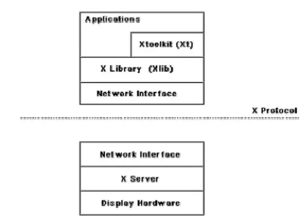
The X-architecture is pictorially depicted. The different terms used in this diagram are explained below.
Architecture of the X-System

X-server. The X server runs on the hardware to which the display and keyboard attached. The X server performs low-level graphics, manages window, and user input functions. The X server controls accesses to a bit-mapped graphics display resource and manages it.
X-protocol. The X protocol defines the format of the requests between client applications and display servers over the network. The X protocol is designed to be independent of hardware, operating systems, underlying network protocol, and the programming language used.
X-library (Xlib). The Xlib provides a set of about 300 utility routines for applications to call. These routines convert procedure calls into requests that are transmitted to the server. Xlib provides low level primitives for developing an user interface, such as displaying a window, drawing characteristics and graphics on the window, waiting for specific events, etc.
Xtoolkit (Xt). The Xtoolkit consists of two parts: the intrinsics and the widgets. We have already seen that widgets are predefined user interface components such as scroll bars, push buttons, etc. for designing GUIs. Intrinsics are a set of about a dozen library routines that allow a programmer to combine a set of widgets into a user interface. In order to develop a user interface, the designer has to put together the set of components (widgets) he needs, and then he needs to define the characteristics (called resources) and behavior of these widgets by using the intrinsic routines to complete the development of the interface. Therefore, developing an interface using Xtoolkit is much easier than developing the same interface using only X library.
Visual Programming
Visual programming is the drag and drop style of program development. In this style of user interface development, a number of visual objects (icons) representing the GUI components are provided by the programming environment. The application programmer can easily develop the user interface by dragging the required component types (e.g. menu, forms, etc.) from the displayed icons and placing them wherever required. Thus, visual programming can be considered as program development through manipulation of several visual objects. Reuse of program components in the form of visual objects is an important aspect of this style of programming. Though popular for user interface development, this style of programming can be used for other applications such as Computer-Aided Design application (e.g. factory design), simulation, etc. User interface development using a visual programming language greatly reduces the effort required to develop the interface.
Examples of popular visual programming languages are Visual Basic, Visual C++, etc. Visual C++ provides tools for building programs with window-based user interfaces for Microsoft Windows environments. In Visual C++, menu bars, icons, and dialog boxes, etc. can be designed easily before adding them to program. These objects are called as resources. Shape, location, type, and size of the dialog boxes can be designed before writing any C++ code for the application.
Difference between user-centered design and design by users
• User-centered design is the theme of almost all modern user interface design techniques. However, user-centered design does not mean design by users. One should not get the users to design the interface, nor should one assume that the user’s opinion of which design alternative is superior is always right.
• Users have good knowledge of the tasks they have to perform, they also know whether they find an interface easy to learn and use but they have less understanding and experience in GUI design than the GUI developers.
Implications of human cognition capabilities on user interface design
An area of human-computer interaction where extensive research has been conducted is how human cognitive capabilities and limitations influence the way an interface should be designed. The following are some of the prominent issues extensively discussed in the literature.
• Limited memory. Humans can remember at most seven unrelated items of information for short periods of time. Therefore, the GUI designer should not require the user to remember too many items of information at a time. It is the GUI designer’s responsibility to anticipate what information the user will need at what point of each task and to ensure that the relevant information is displayed for the user to see. Showing the user some information at some point, and then asking him to recollect that information in a different screen where they no longer see the information places a memory burden on the user and should be avoided wherever possible.
• Frequent task closure. Doing a task (except for very trivial tasks) requires doing several subtasks. When the system gives a clear feedback to the user that a task has been successfully completed, the user gets a sense of achievement and relief. The user can clear out information regarding the completed task from memory. This is known as task closure. When the overall task is fairly big and complex, it should be divided into subtasks, each of which has a clear sub goal which can be a closure point.
• Recognition rather than recall. Information recall incurs a larger memory burden on the users and is to be avoided as far as possible. On the other hand, recognition of information from the alternatives shown to him is more acceptable.
• Procedural versus object-oriented. Procedural designs focus on tasks, prompting the user in each step of the task, giving them few options for anything else. This approach is the best applied in situations where the tasks are narrow and well-defined or where the users are inexperienced, such as an ATM. An object-oriented interface on the other hand focuses on objects. This allows the users a wide range of options.
GUI design methodology
GUI design methodology consists of the following important steps:
• Examine the use case model of the software. Interview, discuss, and review the GUI issues with the end-users.
• Task and object modeling
• Metaphor selection
• Interaction design and rough layout
• Detailed presentation and graphics design
• GUI construction
• Usability evaluation
The starting point for GUI design is the use case model. This captures the important tasks the users need to perform using the software. As far as possible, a user interface should be developed using one or more metaphors. Metaphors help in interface development at lower effort and reduced costs for training the users. Over time, people have developed efficient methods of dealing with some commonly occurring situations. These solutions are the themes of the metaphors. Metaphors can also be based on physical objects such as a visitor’s book, a catalog, a pen, a brush, a scissor, etc. A solution based on metaphors is easily understood by the users, reducing learning time and training costs. Some commonly used metaphors are the following:
• White board
• Shopping cart
• Desktop
• Editor’s work bench
• White page
• Yellow page
• Office cabinet
• Post box
• Bulletin board
• Visitor’s book
Task and Object Modeling
A task is a human activity intended to achieve some goals. Example of task goals can be:
• reserve an airline seat
• buy an item
• transfer money from one account to another
• book a cargo for transmission to an address
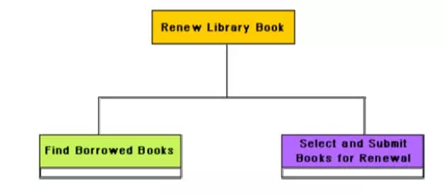
A task model is an abstract model of the structure of a task. A task model should show the structure of the subtasks that the user needs to perform to achieve the overall task goal. Each task can be modeled as a hierarchy of subtasks. A task model can be drawn using a graphical notation similar to the activity network model. Tasks can be drawn as boxes with lines showing how a task is broken down into subtasks. An underlined task box would mean that no further decomposition of the task is required. An example decomposition of a task into subtasks
Decomposition of a task into subtasks

Selecting a metaphor
The first place one should look for while trying to identify the candidate metaphors is the set of parallels to objects, tasks, and terminologies of the use cases. If no obvious metaphors can be found, then the designer can fall back on the metaphors of the physical world of concrete objects. The appropriateness of each candidate metaphor should be tested by restating the objects and tasks of the user interface model in terms of the metaphor. Another criterion that can be used to judge metaphors is that the metaphor should be as simple as possible, the operations using the metaphor should be clear and coherent and it should fit with the users’ ‘common sense’ knowledge. For example, it would indeed be very awkward and a nuisance for the users if the scissor metaphor is used to glue different items.
Example: We need to develop the interface for the automation shop, where the users can examine the contents of the shop through a web interface and can order them.
Several metaphors are possible for different parts of this problem.
• Different items can be picked up from racks and examined. The user can request for the catalog associated with the items by clicking on the item.
• Related items can be picked from the drawers of an item cabinet.
• The items can be organized in the form of a book, similar to the way information about electronic components are organized in a semiconductor hand book.
Once the users make up their mind about an item they wish to buy, they can put them into a shopping cart.
User interface inspection
Nielson [Niel94] studied common usability problems and built a check list of points which can be easily checked for an interface. The following check list is based on the work of Nielson [Niel94].
Visibility of the system status. The system should as far as possible keep the user informed about the status of the system and what is going on.
Match between the system and the real world. The system should speak the user’s language words, phrases, and concepts familiar to that used by the user, rather than using system-oriented terms.
Undoing mistakes. The user should feel that he is in control rather than feeling helpless or to be at the control of the system. An important step toward this is that the users should be able to undo and redo operations.
Consistency. The user should not have to wonder whether different words, concepts, and operations mean the same thing in different situations.
Recognition rather than recall. The user should not have to recall information which was presented in another screen. All data and instructions should be visible on the screen for selection by the user.
Support for multiple skill levels. Provision of accelerations for experienced users allows them to efficiently carry out the actions they frequently require performing.
Aesthetic and minimalist design. Dialogs should not contain information which are irrelevant and are rarely needed. Every extra unit of information in a dialog competes with the relevant units and diminishes their visibility.
Help and error messages. These should be expressed in plain language (no codes), precisely indicating the problem, and constructively suggesting a solution.
Error prevention. Error possibilities should be minimized. A key principle in this regard is to prevent the user from entering wrong values. In situations where a choice has to be made from among a discrete set of values, the control should present only the valid values using a drop-down list, a set of option buttons or a similar multichoice control. When a specific format is required for attribute data, the entered data should be validated when the user attempts to submit the data.


Comments are closed