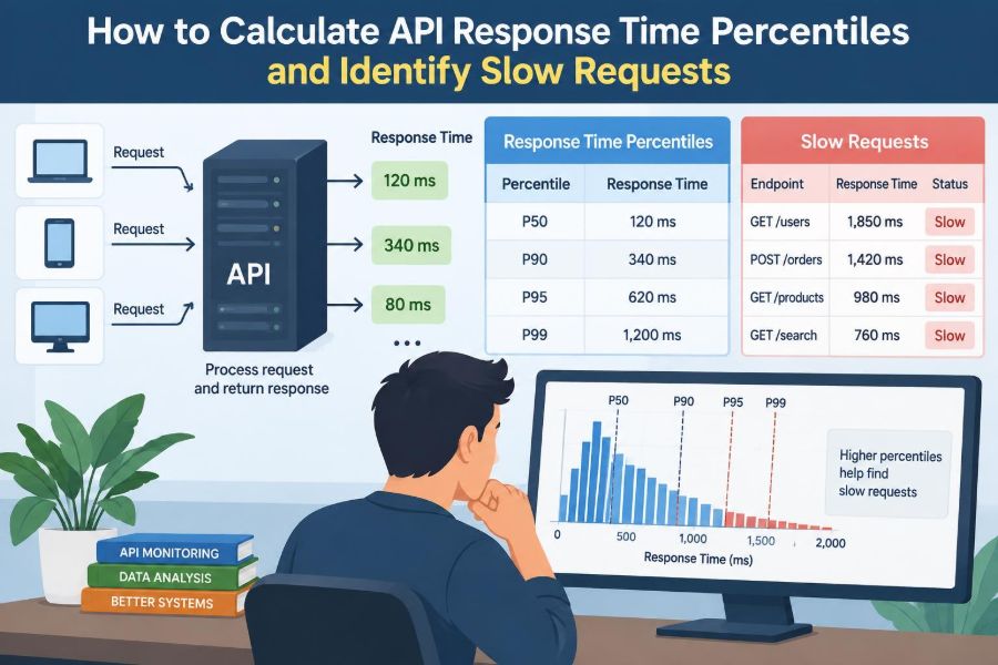

A checkout endpoint can look healthy in a dashboard: its average response time is 180 ms, comfortably under a 500 ms target. Yet a customer trying to pay may wait four seconds, retry the request, and abandon the page. The average did not describe that customer’s experience.
This gap appears in nearly every API-backed system. Most requests may be quick, while a smaller group is slowed by database contention, a cold cache, a distant dependency, or a saturated worker pool. Those slower requests are easy to hide when teams report only one summary number.
Percentiles turn a pile of individual timings into a clearer account of what users actually encounter. They also help engineers ask better questions: how often is the service slow, how slow is the tail, and which requests created it?
Calculating percentiles is straightforward once the data and definitions are sound. The harder—and more valuable—work is measuring the right interval, preserving enough detail to investigate, and responding to changes without chasing noise.
🧭 Start with the user-visible question
Before choosing a metric, state the experience you are trying to protect. “How long does POST /orders take from the client’s perspective?” is more useful than “What is the service latency?” because it identifies an operation, a viewpoint, and a unit.
Response time usually means elapsed time from receiving a request until sending a response. Depending on the measurement point, it may include network transit, queueing, application work, database calls, and response transfer. Documenting that boundary prevents misleading comparisons later.
📏 Understand response time, latency, and duration
Teams often use these words interchangeably, but their measurement boundaries can differ. Server duration may start after a load balancer forwards a request; client-perceived latency can start before DNS lookup or connection setup.
Neither view is universally correct. Server timing is excellent for diagnosing code and infrastructure, while client or synthetic-probe timing exposes the experience across the network. Label every metric with its perspective rather than assuming the name explains it.
📊 Why averages can conceal a bad experience
An arithmetic mean adds all timings and divides by the number of requests. It is simple, but a few extreme values can move it substantially, and a good mean can coexist with a frustrating slow minority.
Consider ten hypothetical requests: nine take 100 ms and one takes 2,000 ms. Their mean is 290 ms. A reader seeing only that number cannot tell whether every request takes roughly 290 ms or whether one in ten waits two seconds.
That distinction matters for interactive APIs. Users do not experience the mean; each user experiences one request, often during a moment such as login, payment, or document save.
🔢 Define a percentile precisely
The p95, or 95th percentile, is a threshold below which approximately 95% of observed request durations fall. Put another way, about 5% of requests are at or above that part of the distribution.
Similarly, p50 is the median, p90 represents a slower slice, and p99 focuses on the far tail. A p95 of 400 ms does not mean that the slowest 5% each take 400 ms. It says 400 ms is the boundary around that rank.
🪜 Read common percentile labels
| Metric | What it summarizes | Typical use |
|---|---|---|
| p50 | Middle request | Typical behavior and broad regressions |
| p90 | Slower tenth of requests | Early tail-latency warning |
| p95 | Slowest portion excluding the last 5% | Service objectives and operational review |
| p99 | Far tail, excluding roughly the last 1% | Rare but severe delays, with adequate volume |
| Maximum | Single slowest recorded observation | Incident clues, not stable trend comparison |
There is no magic percentile. A user-facing, high-volume endpoint may deserve p99 attention; a low-volume administration endpoint may produce a noisy p99 where p90 and raw examples are more informative.
🧮 Sort raw observations to calculate a percentile
For a small set of raw durations, sort values from fastest to slowest. With 20 observations, the p95 lies near the 19th value in ordered data, depending on the percentile convention your tool uses.
Suppose sorted durations in milliseconds end with 120, 125, 132, 210, 780. The values near the 95th rank will reveal the 780 ms outlier or the 210 ms boundary, depending on sample size and rank. The key idea is ranking observations, not averaging them.
For production datasets, let a trusted metrics system calculate this rather than copying timings into a spreadsheet during an incident.
🧾 Know that percentile formulas vary
There are several valid conventions for converting a percentile such as 95 into a position in a finite sample. Some select the nearest ranked value; others interpolate between neighboring values. Different libraries can therefore return slightly different answers from the same small dataset.
That is not necessarily an error. Record the tool and method, avoid comparing unlike implementations as if they were identical, and focus operational discussions on meaningful changes rather than tiny rounding differences.
🪣 Use histograms for scalable measurement
Keeping every request duration forever is expensive at scale. A histogram counts observations in duration buckets, such as requests at or below 100 ms, 250 ms, 500 ms, and one second.
Monitoring systems can estimate percentiles from those cumulative bucket counts over a selected time range. This is efficient and aggregation-friendly: many application instances can contribute counts that are combined before calculating a fleet-wide percentile.
The trade-off is precision. A percentile estimated from broad buckets cannot identify a boundary more precisely than the bucket layout allows.
🧱 Choose bucket boundaries with care
Histogram buckets should be denser around thresholds that influence decisions. If an endpoint’s target is 300 ms, buckets around 200, 250, 300, 350, and 500 ms may be more useful than a large jump from 100 to 1,000 ms.
Use progressively wider buckets for longer durations because latency distributions often span milliseconds to seconds. Too few buckets hide changes; too many increase metric storage and series-processing cost. Revisit the design when service objectives change.
🗂️ Preserve raw examples with traces and logs
Histograms tell you that a tail became slower. They usually cannot tell you which request, customer workflow, query, or downstream call caused it. For that, keep request logs and distributed traces, sampled at a rate appropriate for your traffic and budget.
A useful slow-request record includes the endpoint, method, status code, duration, timestamp, trace ID, deployment version, and safe contextual fields. Do not put access tokens, full personal data, or sensitive request bodies into observability data.
🔗 Correlate metrics, traces, and logs
Metrics are broad and fast: use them to notice a p95 shift. Traces show a request’s path through services and dependencies. Logs add detailed events, errors, and application context.
A trace ID links these layers. When a dashboard shows a rise after 14:05, filter traces from that interval, select slow examples, then follow their IDs into logs. This workflow is much faster than searching an entire log stream for the word “slow.”
🧪 Build a small calculation example
Imagine 100 requests to GET /catalog in five minutes. Ninety have durations at or below 180 ms, five fall between 181 and 350 ms, four fall between 351 and 900 ms, and one takes 2,400 ms.
The p90 is around 180 ms. The p95 is around 350 ms, while p99 is near 900 ms or higher depending on the chosen rank convention. The maximum is 2,400 ms. Each number contributes a different part of the story.
If the next interval has the same p50 but a p95 of 850 ms, typical browsing may look unchanged while a meaningful group has become slower.
⏱️ Select a useful time window
Percentiles always describe a population over a period. A one-minute view reacts quickly but can jump around with sparse traffic. A one-hour view is steadier but can dilute a short-lived failure.
Use multiple views: a short window for active investigation and a longer rolling window for trend context. During incident review, align windows with deployments, traffic spikes, and dependency events so causes and effects can be compared honestly.
👥 Segment requests before drawing conclusions
A single percentile across every route is rarely actionable. A fast health check can mask a slow report export, and a high-volume read endpoint can dominate the combined result. Calculate percentiles by meaningful endpoint or operation.
Further segmentation can include HTTP method, status class, region, client type, or deployment version. Each label adds diagnostic value but also creates more metric series. Keep labels bounded and operationally useful.
🏷️ Avoid high-cardinality metric labels
Cardinality is the number of distinct label combinations a metric can produce. Labels such as user ID, request ID, email address, or a full URL containing arbitrary identifiers can create an unbounded number of time series.
That can overload a monitoring backend and make queries costly. Normalize paths such as /users/:id, use trace IDs in logs rather than metric labels, and reserve detailed per-request context for traces or structured events.
🚦Separate success, errors, and timeouts
A percentile containing successful responses, fast validation failures, and timed-out requests may be hard to interpret. A 400 validation response can be quick while still representing a product issue; a timeout may not emit a completed application duration at all.
Track latency by status class or outcome where it answers a real question. Also track error rate and timeout rate alongside latency. A lower p95 is not good news if slow requests were simply terminated earlier or excluded from measurement.
🌐 Measure the full request path
An API request can wait in many places: a CDN or gateway, a load balancer, a connection pool, an application queue, application code, a database, and a third-party service. Measuring only controller execution misses time spent before the handler starts.
Instrument key boundaries. Gateway timing identifies edge delays; application timing exposes service work; dependency spans show where a trace waited. Comparing boundaries helps distinguish a busy application from a network or queueing problem.
🧵 Recognize queueing as a latency multiplier
When utilization approaches capacity, requests may spend more time waiting than being processed. A handler that normally executes in 50 ms can produce a one-second response when it sits behind a growing queue.
Look for increased queue depth, active worker saturation, connection-pool waits, and concurrent-request limits alongside tail latency. Adding capacity can help, but so can reducing expensive work, controlling admission, or smoothing bursty jobs.
🗄️ Investigate database-driven slow requests
Database work is a common source of long tails because data shape and contention vary between requests. An unindexed filter, an unexpectedly large result set, lock waiting, or a saturated connection pool may affect only some requests.
Use trace spans to identify slow queries, then inspect query plans and database metrics in a safe environment. Avoid assuming a query is guilty merely because it appears in a slow trace; it may have been waiting on a connection before it began.
🧊 Account for caches and cold starts
Cache hits and cache misses can create a visibly bimodal distribution: one cluster of fast requests and another that performs database or remote work. A percentile rising after a cache eviction may be expected briefly, but repeated misses may indicate a key, capacity, or expiry design problem.
Serverless or autoscaled environments can also introduce cold-start delays. Tagging runtime or instance lifecycle information in traces can reveal whether the tail is tied to initialization rather than ordinary request processing.
🔌 Examine downstream dependencies
A service can only respond as quickly as its critical path allows. Payment, identity, search, messaging, or internal APIs may occasionally slow down, and retries can amplify the load during that slowdown.
Record dependency duration separately from total request time. Define timeouts, apply bounded retries where they are safe, and use circuit breakers or graceful degradation when a nonessential dependency is unhealthy. These are design choices, not substitutes for observing the dependency.
🔄 Watch for retry amplification
A timeout can prompt a client, gateway, application, and dependency client to retry the same logical operation. Several layers retrying independently can turn a brief slowdown into a burst of duplicate work.
Inspect traces for repeated attempts and record an operation or idempotency key safely. Coordinate retry ownership, use exponential backoff with limits, and ensure write operations can tolerate retries without producing duplicate side effects.
📉 Detect regressions after a release
Overlay deployment markers on percentile charts. If p95 rises immediately after a release for the new version while traffic mix is stable, the version is a strong lead—not proof, but a reason to compare traces and code paths.
Compare the same endpoint, outcomes, regions, and traffic conditions before and after deployment. A release may coincide with a campaign, cache flush, schema migration, or dependency event, so controlled comparison matters.
🎯 Set targets that reflect the service
A latency target should connect to a user task or system contract. A search suggestion endpoint may need a tighter target than an asynchronous export submission, whose first response only confirms that a job was accepted.
State the scope plainly: for example, a percentile, endpoint group, measurement location, and time window. Pair latency targets with availability and correctness measures; a fast but incorrect response does not satisfy users.
🚨 Alert on sustained, actionable changes
An alert should lead to a plausible action. Paging every time p99 twitches creates alert fatigue, especially on low-volume routes where one slow request has an outsized effect.
Prefer alerts that require a threshold breach to persist across several evaluation periods, combine latency with traffic volume where suitable, and route lower-urgency anomalies to dashboards or tickets. The exact policy should match on-call coverage and service criticality.
🔍 Find individual slow requests systematically
Start from the affected endpoint and time interval, then filter traces or logs by duration above a meaningful threshold. Sort by duration and compare several slow examples rather than trusting the single slowest request.
- Confirm the measurement boundary and whether the request completed, failed, or timed out.
- Group examples by a shared feature: route, dependency, database query, region, version, or client.
- Compare each slow trace with a normal trace for the same operation.
- Test the most credible hypothesis with instrumentation, a query plan, a controlled load test, or a rollback decision.
The pattern across samples is usually more informative than one dramatic outlier.
🧯 Treat outliers as clues, not automatic bugs
A single 30-second request can result from a client disconnect, a one-time DNS issue, garbage collection, a paused virtual machine, or an unusual but legitimate large payload. It deserves inspection, but it does not automatically define normal service behavior.
Conversely, repeated 800 ms requests may be more urgent than one spectacular outlier if they affect a meaningful share of users. Percentiles provide frequency context; traces supply the case details.
🧠 Avoid aggregating percentiles incorrectly
Do not average p95 values from instances and call the result a fleet p95. Percentiles are not additive: an instance handling a small number of very slow requests and another handling high-volume fast traffic cannot be represented accurately by averaging their summaries.
Aggregate histogram buckets or raw observations first, then calculate the percentile over the combined population. This principle also applies when combining regions, endpoints, or time periods with very different traffic volumes.
🧰 Test instrumentation before relying on it
Instrumentation can fail quietly. Units may be milliseconds in one component and seconds in another; a timer may stop before response serialization; canceled requests may disappear. Validate timing behavior with known delays in a non-production environment where practical.
Check that route names are normalized, histogram buckets receive observations, trace context propagates across services, and dashboards query the intended labels. Observability code is production code and needs review and maintenance.
🛡️ Balance observability with privacy and cost
Detailed telemetry has a cost in storage, query load, and potentially privacy exposure. Sampling, retention limits, payload redaction, and access controls should be explicit parts of the design.
Keep high-value aggregate metrics broadly available, retain detailed traces for a suitable period, and increase sampling temporarily during an investigation if infrastructure permits. Collect enough context to diagnose behavior without treating logs as an unrestricted data archive.
📋 Create a repeatable latency review
A regular review prevents tail latency from being noticed only during incidents. Review the busiest and most user-critical operations, their percentile trends, error and timeout rates, known dependency behavior, and changes introduced by recent releases.
Turn findings into specific work: add a missing index, reduce a payload, tune a pool, split a long-running workflow, improve a dashboard, or revise a target that no longer reflects the product. Record the expected signal so the change can be verified later.
🏁 The core principle: measure distributions, then investigate context
Percentiles are valuable because API response times are distributions, not a single number. p50 describes the middle, p95 and p99 reveal increasingly slow portions of the population, and a maximum highlights individual extremes.
Use aggregated histograms for reliable service-level views, then connect a percentile change to traces and logs that preserve request context. Segment carefully, include failures in the operational picture, and calculate percentiles only after combining the underlying observations or buckets.
The goal is not to chase every slow request; it is to understand who is affected, how often it happens, and which part of the request path can be improved. With that discipline, latency metrics become evidence for practical engineering decisions rather than decoration on a dashboard. ⚙️📈🔍